GRAPHS
|
|
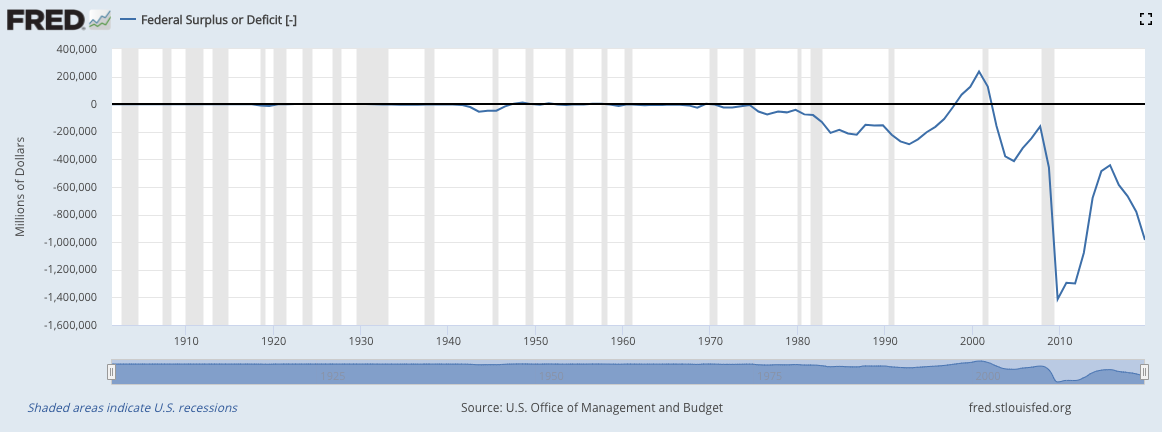
In this graph, it represents the federal budget (Black line). As you can see the blue line drops dramatically, because there has been something that occured to make it drop.
|
Our Team
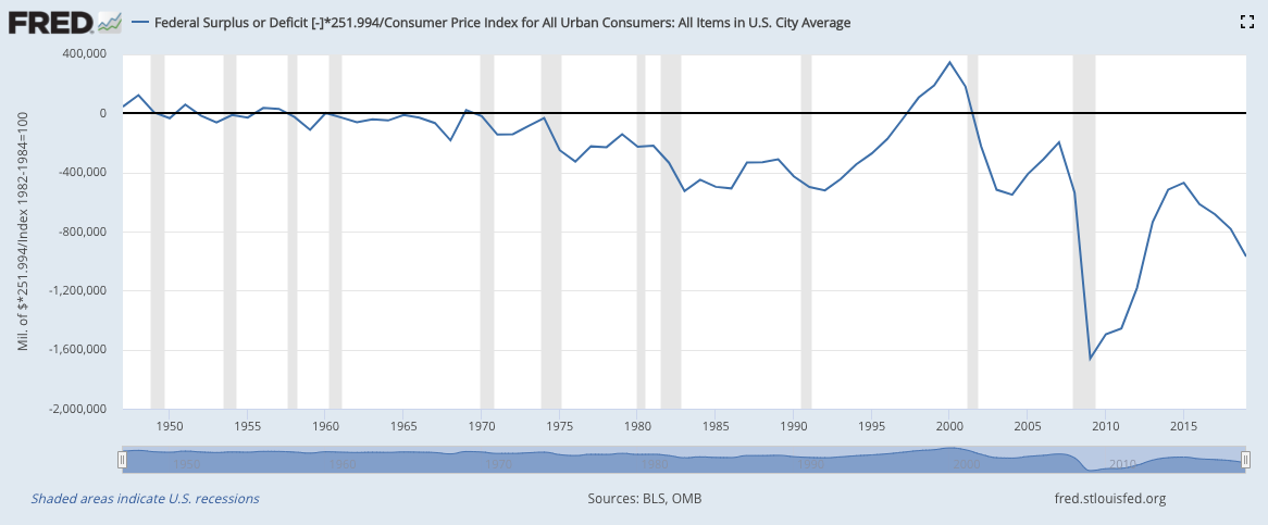
Graph 2This graph, which looks very similar to graph #1, is indicating the the price levels have increased.
|
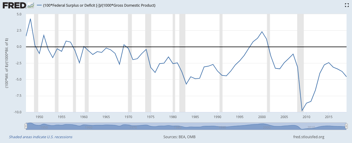
Graph 3GDP.
|
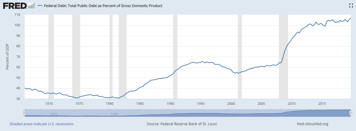
Graph 4Total Public Debt
|
